Tytl is a London property data platform for estate agents and buyers across the UK housing market. They'd been through a rebrand - logo, colours, typography, and needed those foundations built out into a working system: templates, guidelines, assets that let the team move without a designer on every decision.
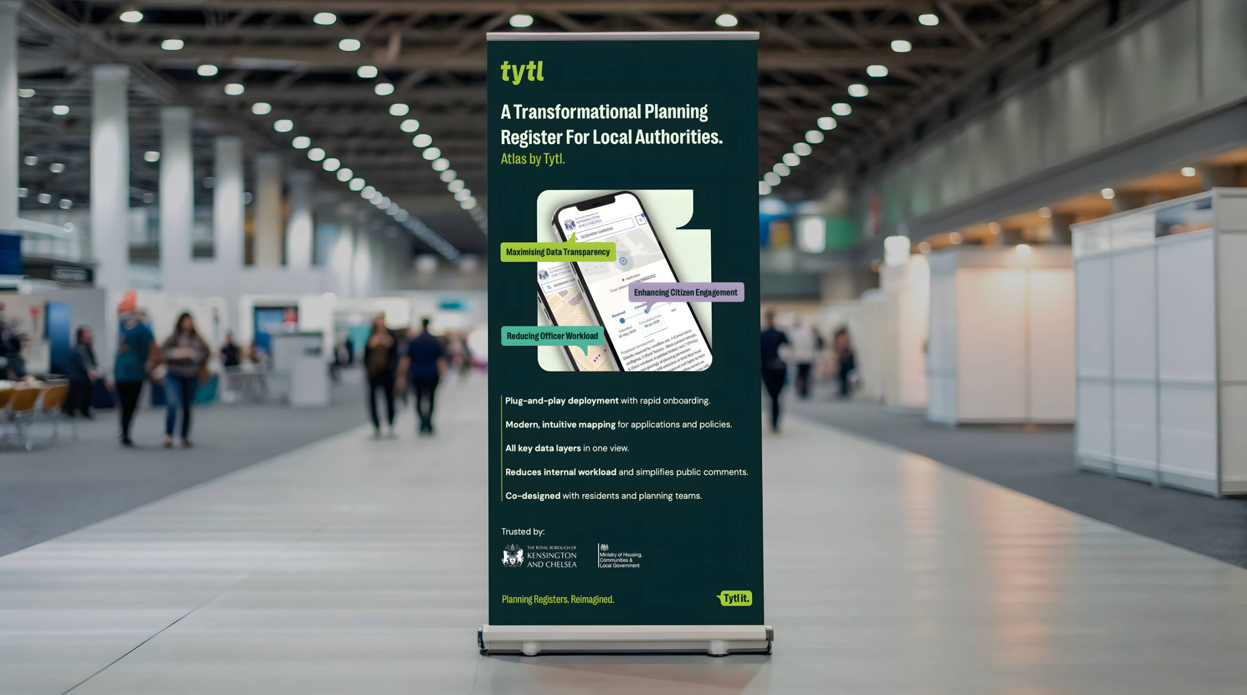
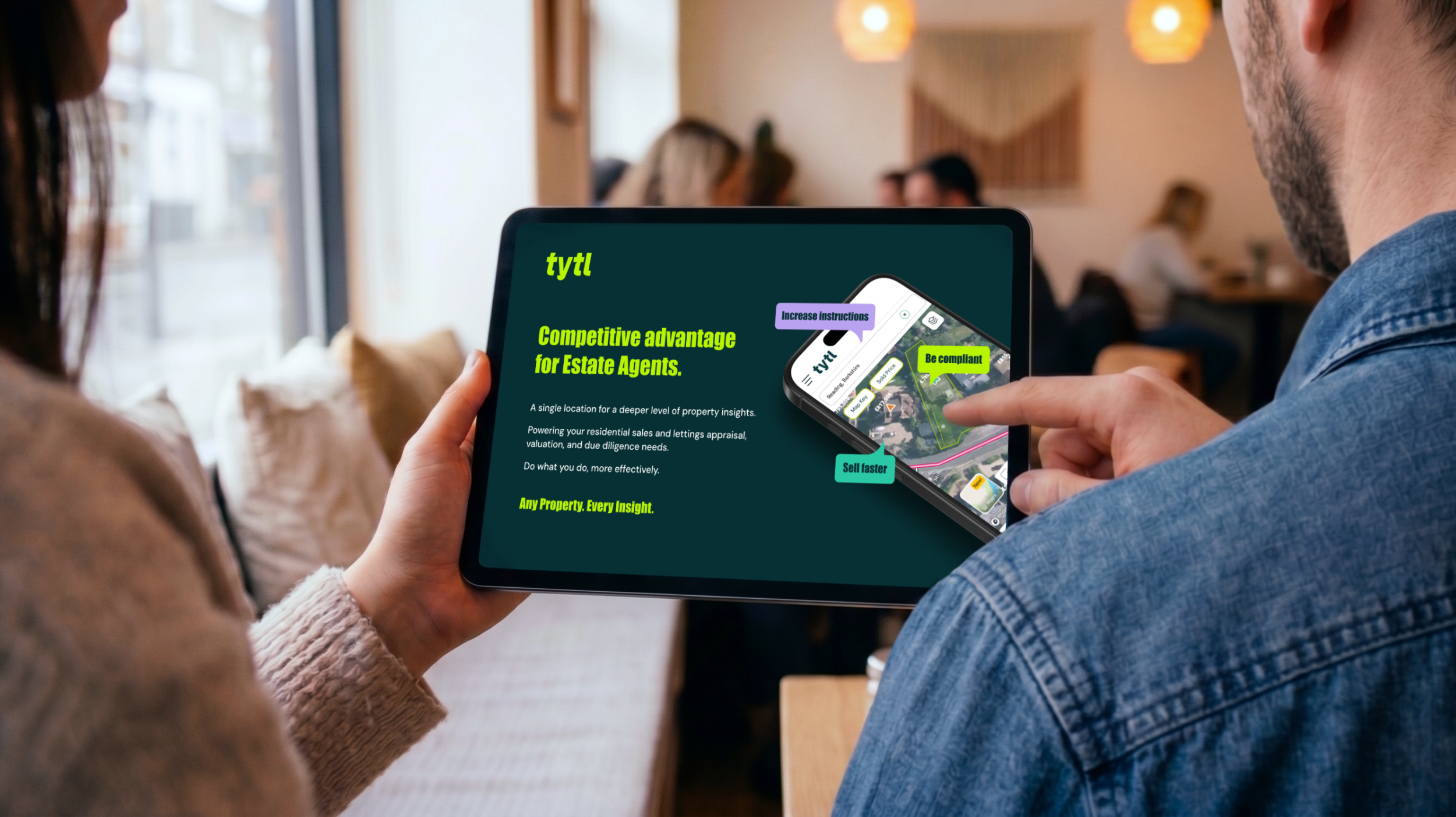
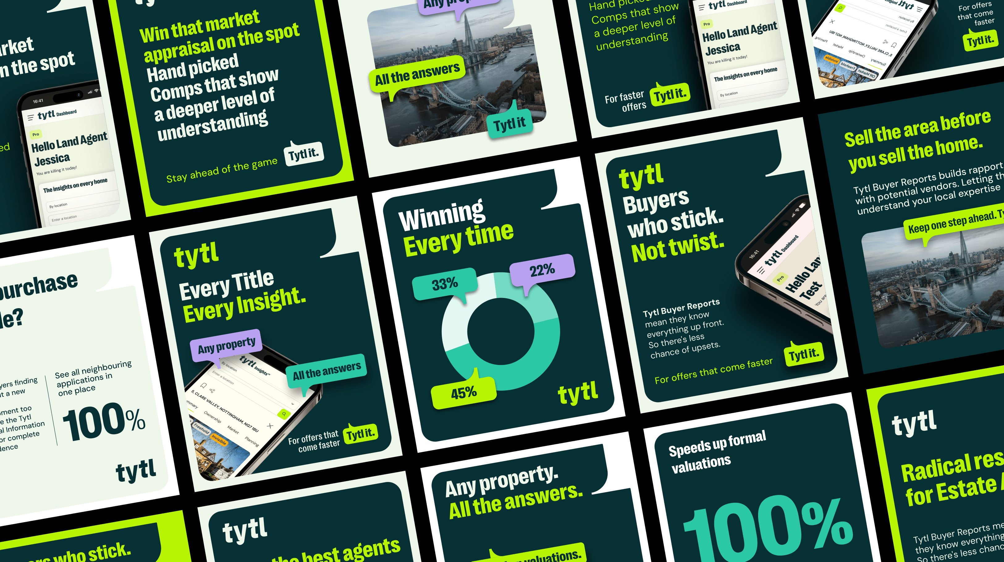
We designed the deployment layer. Social templates that turned property listings into branded content. Pitch decks that held the visual identity under investor scrutiny. Business cards, pull-up banners for property shows, brand guidelines covering typography hierarchy, colour application, image treatment, layout rules.
The work was translation, taking brand elements that worked on a page and making them work in a pitch deck at 11pm, on an Instagram story shot on a phone, or a 2-metre banner in a conference hall. Tytl's team could produce content quickly and consistently because the system knew how to flex.
From property showcases to funding conversations, the brand held together. It's the difference between having a logo and having a brand that works.
.png)

.png)